Introduction
BuyBay specializes in taking returned products from webshops, assessing and improving them, and reselling them through online sales channels like eBay. Early 2020 BuyBay decided to rebuild its return management software, for its own purposes and to offer it as a SaaS (Software as a Service) solution. A small team did a two week design sprint to redesign the assessment part, which BuyBay calls ‘grading’. The goal was to create a prototype and test it.
My role
- Interviews and observation
- Creating personas and customer journeys
- Creation of a clickable prototype and a test plan
- Visual designs
- Implementation in Ruby on Rails
“Dirk-Jan introduced new grading software that allowed us to increase quality through uniform assessments.”
Analysis
Old software
The old software ran on touchscreen desktops on the grader’s tables. The process was roughly as follows:
- The grader scans a barcode on the product package with a hand scanner
- He inspects the package and opens it
- He inspects the product
- He gives a rating from A to E (see screenshot below)
- He motivates his choice
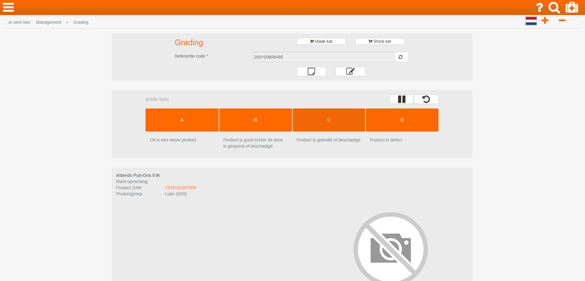
Old software: the grader should enter a rating here
Interviews, personas, customer journeys
To discover potential problems, the product owner and I observed 10 graders and interviewed them. Based on the interviews and the observations we created personas and customer journeys.
A few of the problems we observed:
- New graders have a hard time deciding the A-E rating and motivating it.
- The rating is not objective and highly personal.
- Graders need to take product photos. They lose time in a photo booth because they have to share it with another grader.
- New graders must learn many tasks, such as how to reset products and perform functional tests. They have to consult other graders that are often busy, or search for documentation on A4 papers.
Idea generation and concepts
‘How might we’ questions and brainstorm
To come up with design solutions we formulated ‘how might we’ questions:
- How might we guide graders through the necessary steps in a way that doesn’t slow them down?
- How might we make sure graders consistently arrive at the right conclusion?
- How might we make sure graders don’t spend unnecessary time on an item (e.g. cleaning, unboxing, packing/repacking)?
- How might we make sure graders can quickly take photos without delay?
- How might we guide novice graders without slowing down experts?
We brainstormed with the entire team to generate ideas:
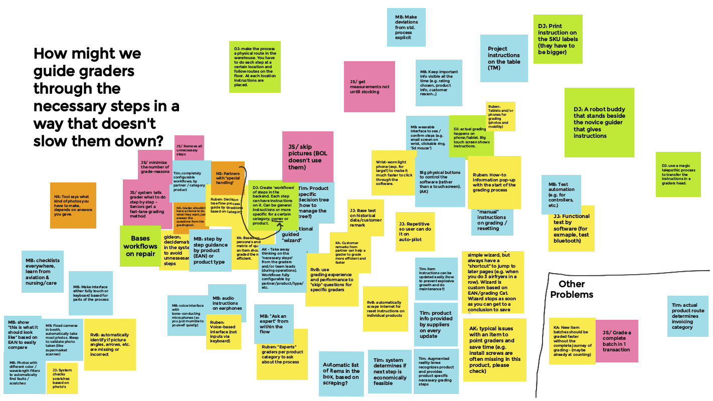
One of the brainstorm results
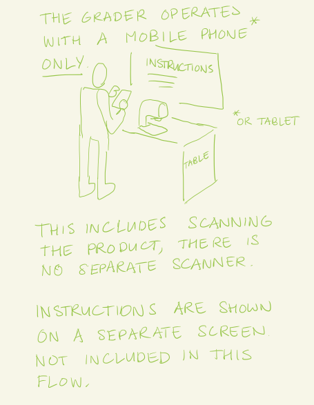
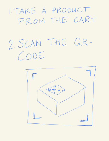
After the brainstorm, four team members each sketched a concept for the UI. I came up with a workflow-based system; the grader would answer a number of sequential questions, each question depending on the product category and previous answers. The system would then decide on the rating by itself.
The software would run on a mobile device, which the grader could also use to scan the product and to take photos.
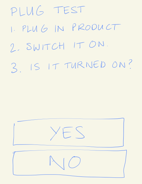
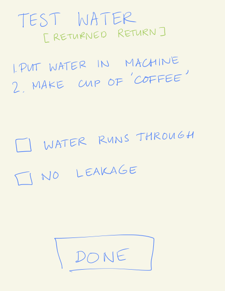
Some of my sketches:
Test with clickable prototype
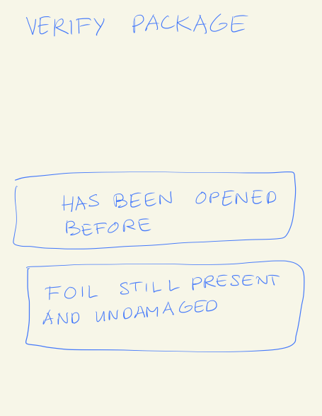
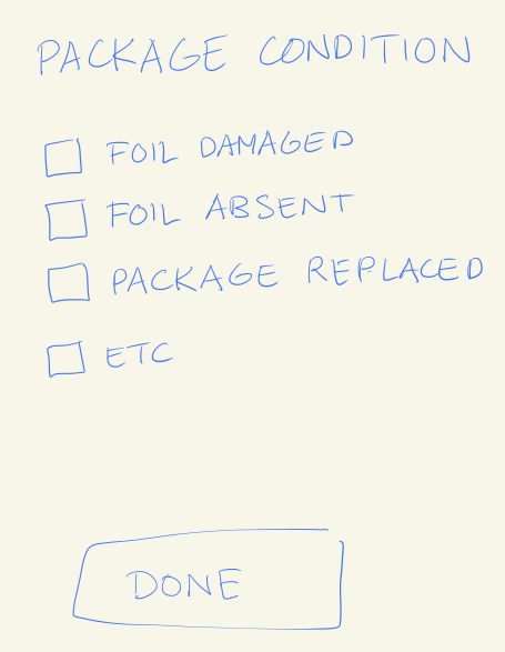
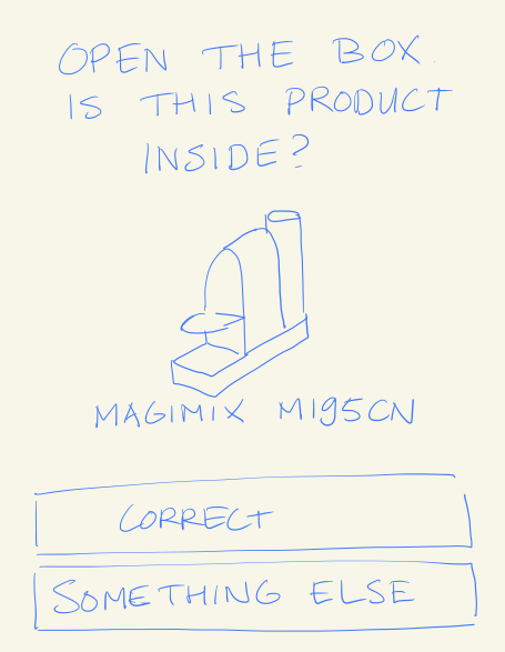
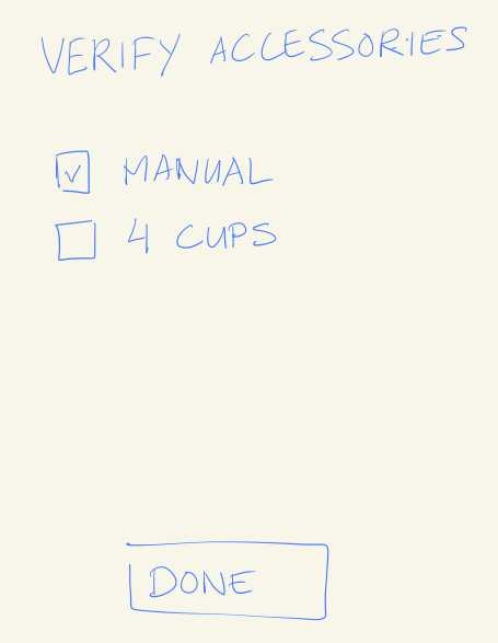
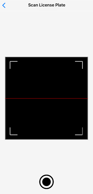
My workflow-concept was selected for further development and I created a clickable prototype in Adobe XD. A few screens of the prototype:
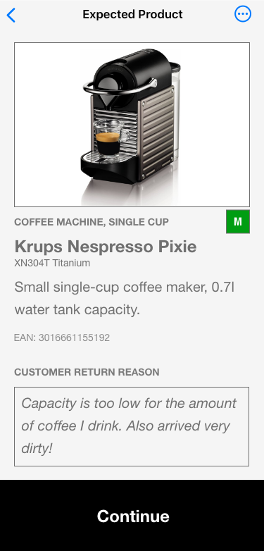
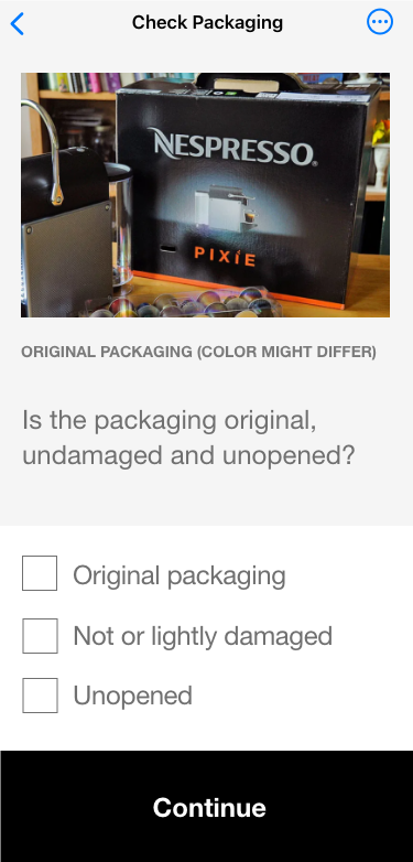
We tested with four different users and three different products, a Nespresso machine, a dishwasher and a laptop. The usability test brought no fundamental problems to light, but a number of small ones. To name a few:
- Graders handling large items use gloves. That makes a touchscreen less ideal for them.
- The same graders often need to use both hands, making it difficult to hold the phone.
- The button to navigate backwards in the workflow was not noticed by all testers.
- One tester put the phone on a table and had a hard time reading the text.
Visual design
After the design sprint I created a visual design. It was designed to be responsive, accommodating both large and small screens, because the company was not sure yet whether it wanted to replace the desktops with phones.
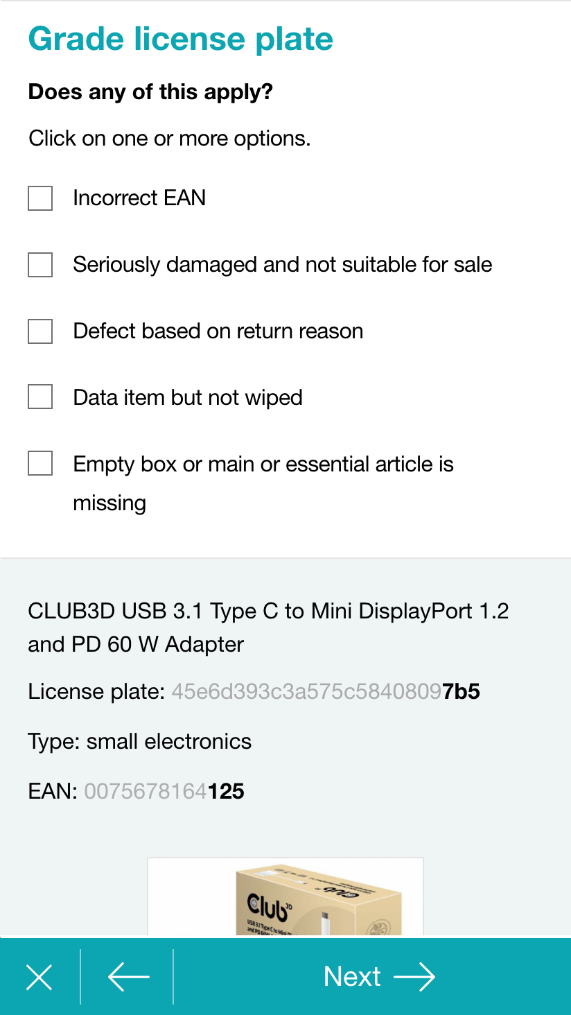
Mobile screen
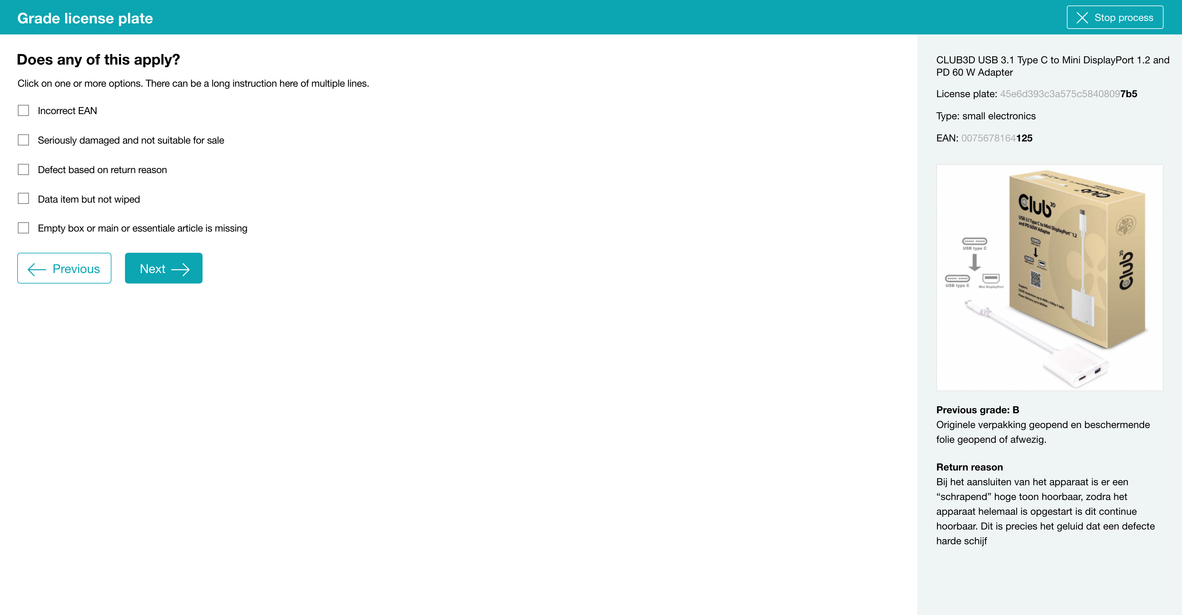
Desktop screen
Implementation
With other developers I created the new SaaS-software in Ruby on Rails. We built the grading system on top of dedicated workflow software so that we would be able to manage all the different products and contexts. To give you an idea, here is a part of a grading workflow:
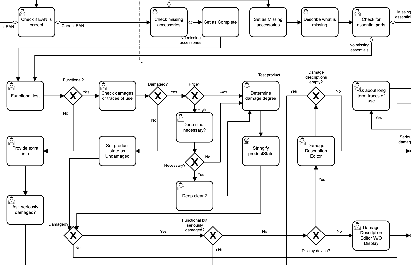
Camunda grading workflow
Result
The workflow idea turned out to be very useful over the years. We created different workflows for unexperienced and experienced graders, for different webshops, for different SaaS tenants and so on.
Tim Mooren, BuyBay’s COO at the time, said: “Dirk-Jan guided us through the design, development and implementation professionally. He introduced new grading software that allowed us to reduce waste and increase quality through uniform assessments. Through its modular design, we were provided with the flexibility we needed.”
I later improved this design for better functionality on touch screens. Read more