Introduction
BuyBay takes returned products from webshops, assesses and improves them, and sells them on online sales channels. When returns arrive in the BuyBay warehouse, so-called counters scan these products to verify if they are the same as the webshop announced. After counting the products are usually ‘graded’; they are inspected, cleaned and given a rating based on the condition. Management wanted to see statistics of the performance of the counters and the graders, so I made a design.
My role
- Visual design
- Partial implementation
Desired counting statistics
- Comparison of the amount of countings for all the counters for the current day
- Variability in the counting performance during the day per counter for the current day
Desired grading statistics (more important than counting)
- Comparison of the amount of gradings for all the gradings for the current day
- Variability in the grading performance during the day per grader for the current day
Visual design
I created a visual design for the requested statistics:
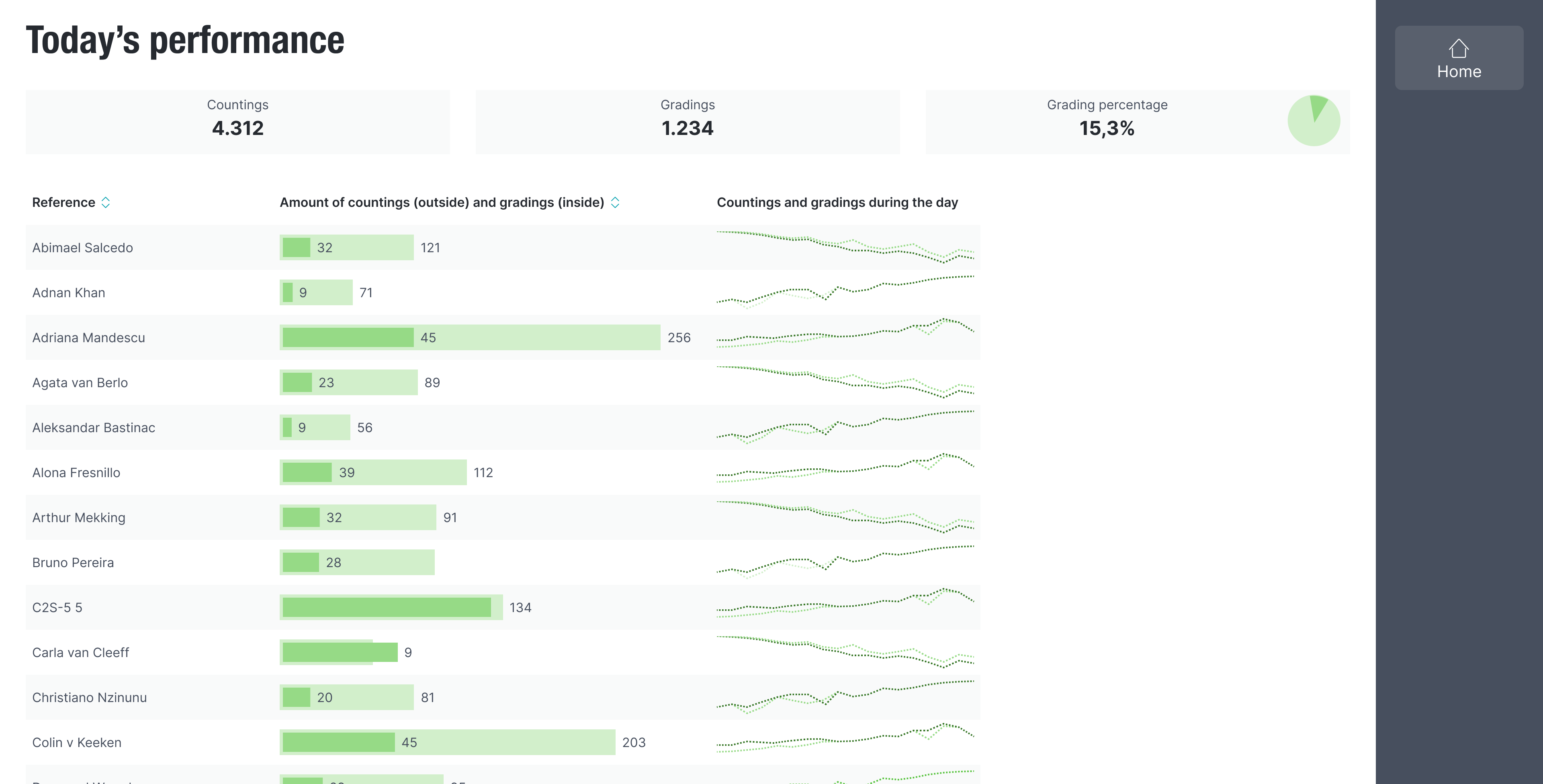
Overview of the performance of all employees
- Because a lot of employers do both counting and grading, I thought it was best to combine both statistics in one view. This way, when a grader does little work on a day for example, you can easily see if this was because they worked more in counting.
- Unlike most bar charts, all the bars and the corresponding labels (the names) are horizontal. That way the labels are much better readable than in traditional vertical bar charts where they would have been presented vertically or diagonally. Also it allows for vertical scrolling which is more user friendly than horizontal scrolling.
- The graphs in the last column are so called ‘sparklines’. Invented by Edward Tufte (I am a fan of his books), they are simple but data-intense.
- The chart looks and acts like other tables in the application:
- You can sort a column, by clicking the header.
- Every row (representing an employee) is clickable. This leads to a page with more details, see below.
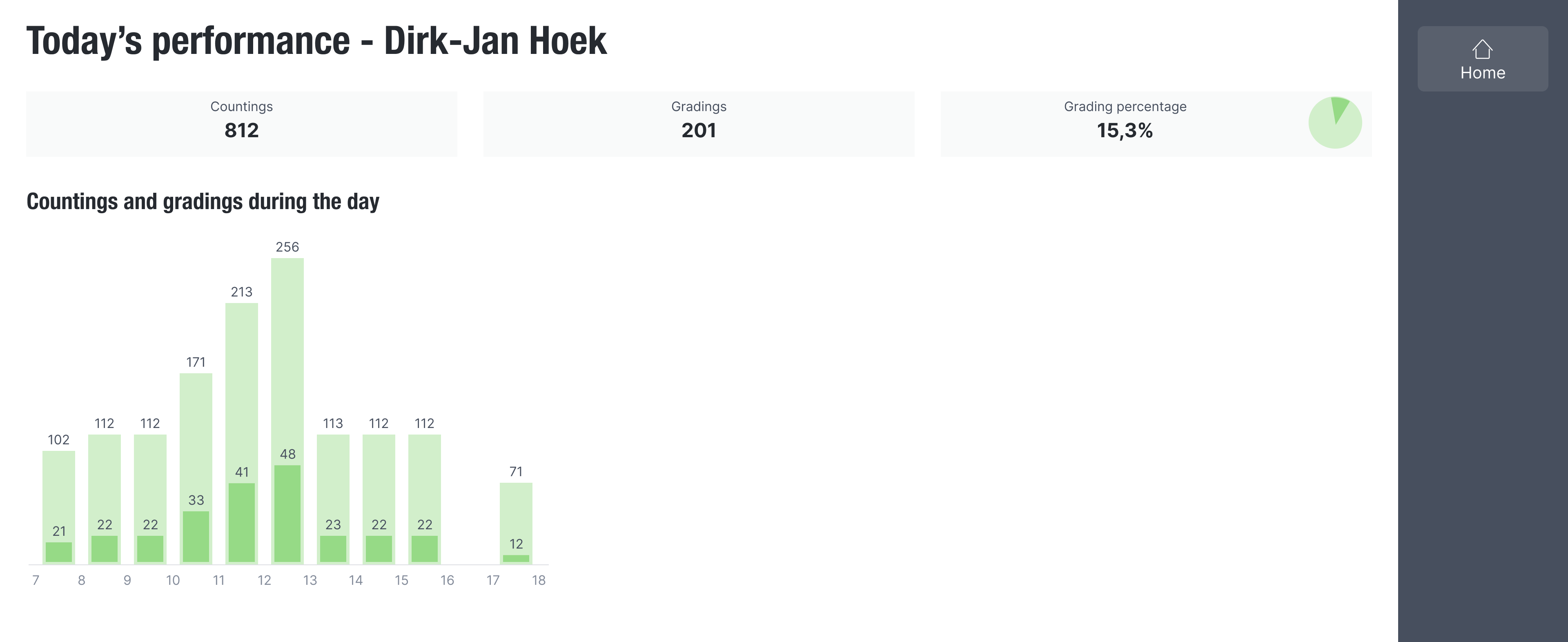
Detailed information for one employee
Implementation
After the designs were approved, I created several stories in Jira. We refined them, and then I picked one of the stories up myself, the one for the sparklines. I did an investigation of charts libraries and picked Chart.js because of its popularity and the fact that it supports multiple superimposed sparklines. I created a Stimulus SparkLinesController to display them.
Result
Management was happy with the new feature. There were never new iterations needed.