Introduction
BuyBay specializes in taking returned products from webshops, assessing and improving them, and reselling them through online sales channels like eBay. To streamline the assessment process, BuyBay developed flexible ‘grading’ software as a SaaS solution, which they also utilize internally.
The first version of this software was primarily designed with mobile phones in mind. However, BuyBay ultimately opted to use Full HD desktop touchscreens, which they already had, and the mobile version was seldom utilized.
While the desktop layout was functional, it was not optimized for the larger screen, resulting in valuable screen real estate being left unused. Additionally, many clickable areas were relatively small, making them difficult to interact with. Recognizing this opportunity for improvement, I created a new design aimed at enhancing the user experience.
My role
- Visual design
- Illustration (I created a 3D icon library)
- Creation of a clickable prototype
- Creation of a test plan and user testing
- Front end development
“The redesign prepared our software to be showcased in client demos and be implemented as SaaS, opening up a completely new proposition for BuyBay.”
Analysis
Here are two examples of the old grading screens:
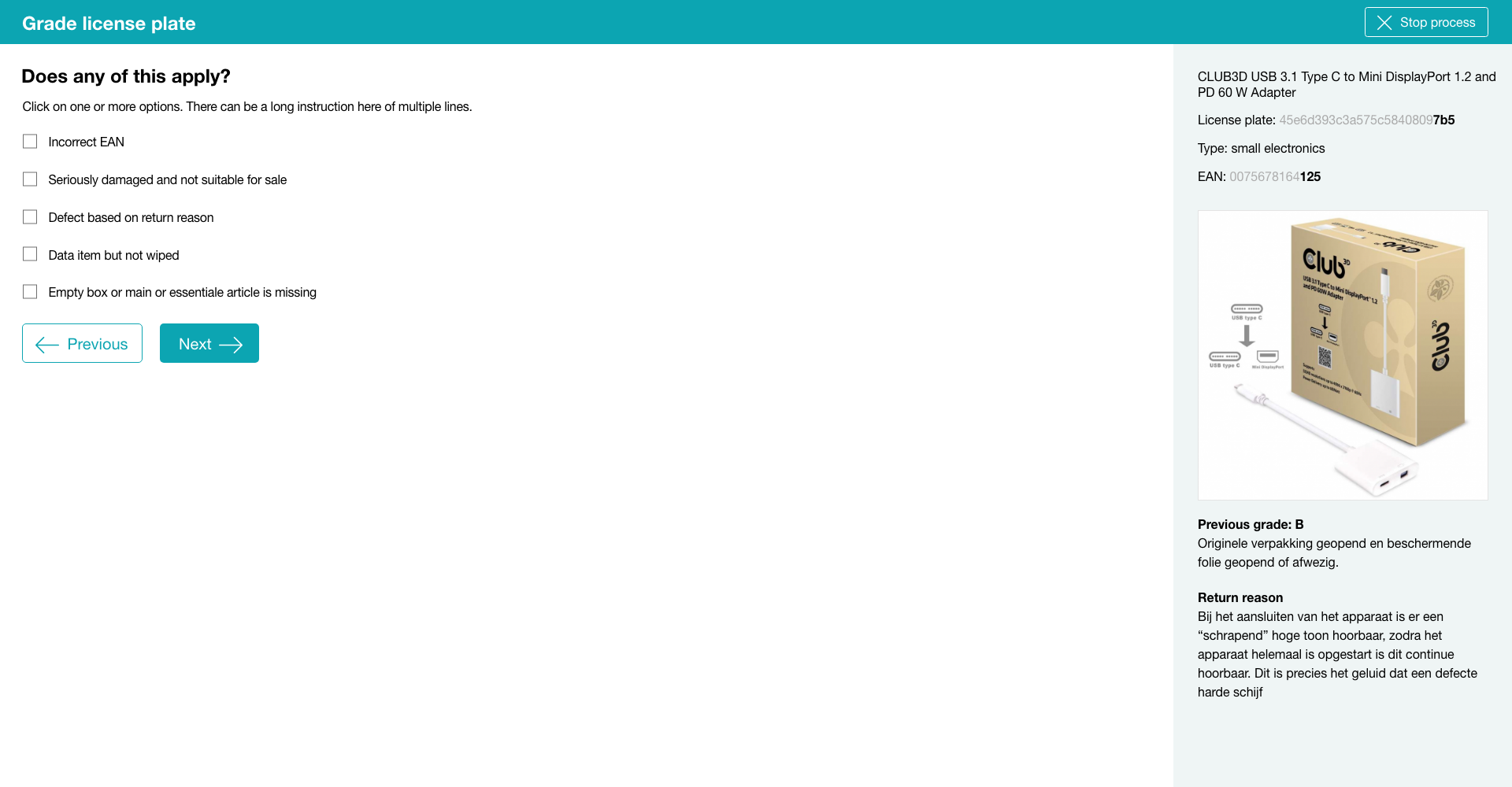
Old design of a grading step: checkbox question (more than one option possible)
Old design of a grading step: radio button question (only one option possible)
I did an ‘expert analysis’ and observations in the work place and noticed the following possibilities for improvement on the screen above:
- The font size is regular (1 rem), but graders are often at a larger distance from the screen than office workers, because they need to unpack boxes, test products and so on. From that distance it is relatively hard to read.
- Check boxes and radio button (labels) are low in height, hard to touch with a finger.
- A lot of questions have answers that are very similar (see the first screen in ‘Visual design’). You have to read well to spot the difference and that takes time.
- The ordering of answers is random. Sometimes the most favourable is first, sometimes last. You can not rely on muscle memory.
- The pane on the right does not always provide enough information. In that case users have to search for more information, slowing them down.
- The third party workflow software we used caused noticable delays when navigating to a new question.
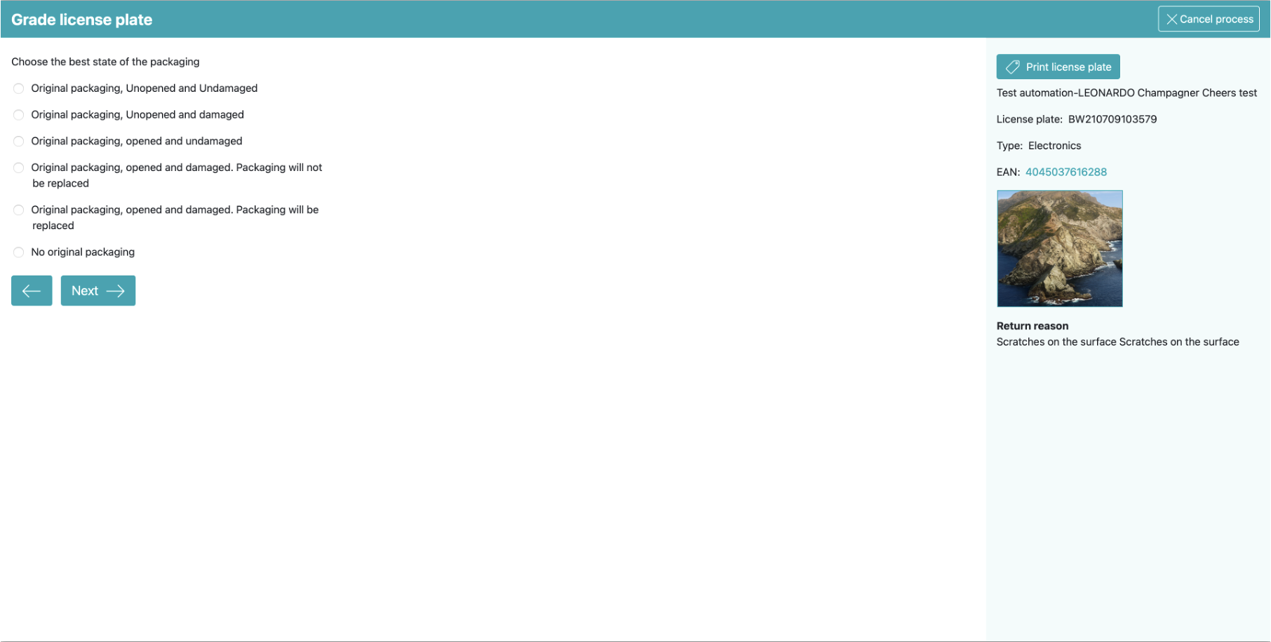
Visual design
I created a new design in Figma:
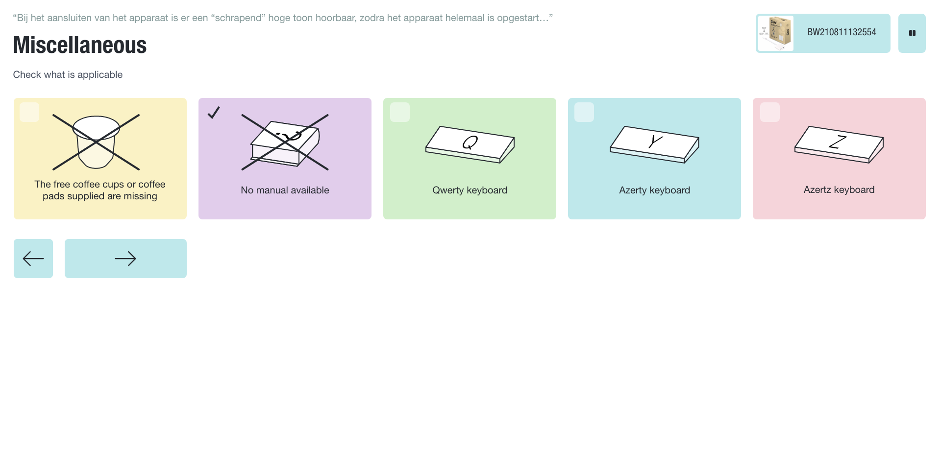
Redesign of the grading step with ‘radio button’ answers (only one possible answer)
Improvements:
- Large buttons that are easy to hit.
- Icons that can be recognised quickly, so that you do not have to read after you learned their meaning. I created a large library to accommodate every possible question in the flow.
- Color coding: green is good, red is not.
- Consistent ordering, most favourable answer is always first.
- Relatively large text, because the graders are typically far away from the screen.
- Faster navigation: if only one answer is possible (a ‘radio button’ answer), the next step is immediately loaded after clicking the answer. It is not required to click the arrow button.
- An animation that scrolled the current step out of view before a new one was presented. This distracted the user from the delay caused by the third party workflow software.
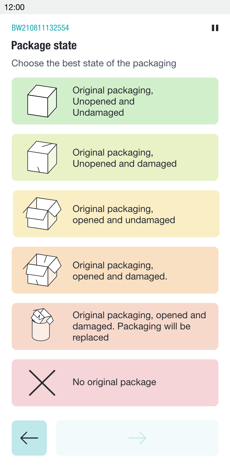
- A button to quickly get all possible information on the return (see screen below).
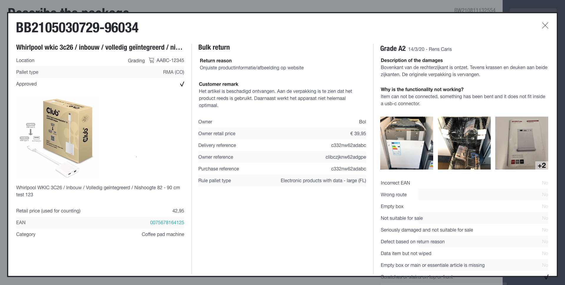
Popup with all information on the current return
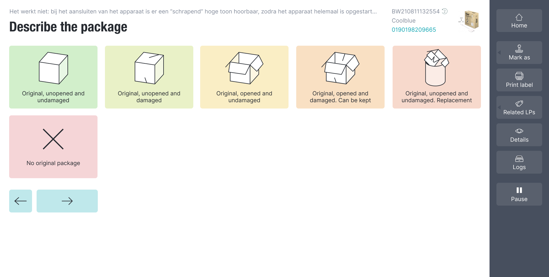
Redesign of a grading step with ‘checkbox’ answers; more than one possible answer
Redesign of the mobile version
Prototype and usability test
I built another prototype and did another usability test with it. Some of the things I wanted to find out:
- If the icons were understood.
- If people would understand the difference in behaviour between ‘radio’ buttons and ‘checkbox’ buttons. A click on the first type would would immediately lead to a new question (to gain speed), while a click on the latter would only check it.
- If people would understand that if they navigated back, that previous choices would be highlighted and that they did not need to select them again.
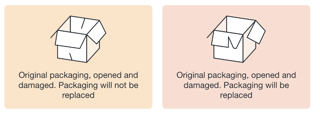
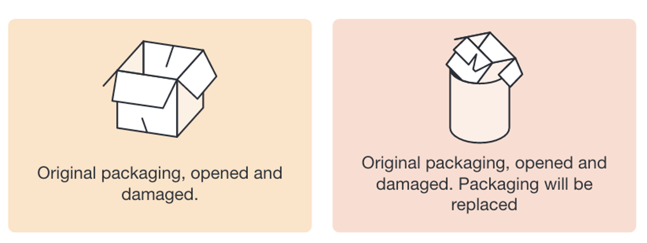
I tested the icons by letting people match descriptions with images. That way I learned that these icons were too smilar:
These icons were too similar
I eventually redesigned them like this:
Icons redesign
Read the full test plan and the results.
Result
The test did not bring big problems to light. When asked, 50% of the test population considered the new design better or much better (they are very conservative, so that is high).
It turned out the visual nature of the user interface was not only helpful to new users, it was also eagerly used in demos to potential SaaS customers, because “it looks so good”.
Tim Mooren, BuyBay’s COO at the time, said: “Dirk-Jan redesigned the UI and look and feel of our new grading software. It allowed our grading center to increase its quality, by preventing mistakes and removing ambiguity. Also, it prepared our software to be showcased in client demos and be implemented as SaaS, opening up a completely new proposition for BuyBay.”